"" MaDDI: March 2013

Wednesday, March 27, 2013

AD Show 2013: Art

From the High Line 2012 (24x24 oil and pencil on panel) by Lisa Breslow

Where most shoppers have will power, I have a gaping hole. The second I see an object I covet, it creates a kind of potential energy (remember potential energy from high school physics?) That energy begs for release. I used to think the only release was to physically obtain it, but blogging has helped me learn to discharge the energy in another way-- by sharing it with all of you! Instead of connecting with an object and thinking "must buy" and I now think, "must blog." Blogging as therapy.

But despite my formidable progress, I have still have a fatal flaw-- great art. And art, dear readers, is a very expensive weakness to have. With clothing, I can sternly remind myself that it will likely languish in my closet. And that it depreciates the second money changes hands.

But not art! Art confers a lifetime of engagement, solace, contemplation, joy...You can pass it on to your children! And your children's children! Then there's that mischievousness voice in my head that whispers, "it's an investment."

The Architectural Digest Home Design Show is a surprisingly good place to discover high-quality affordable art. One artist mentioned that it's long been an "under-the-radar" art fair, where artists and galleries see value in the high traffic and relatively low cost of a booth.

A few of my discoveries include:

  • Artist Cecile Brunswick, who paints the remains of tattered billboards spotted on her travels. I love the idea that a "lower" art form (an advertising or propoganda billboard) morphs into a higher art form (an oil on canvas) through the effects of time.  Because Brunswick often catches only a quick glimpse of the billboard, her paintings are frequently from memory, adding another charming element of distortion that strikes a cord in each of us: the power of time and memory to change what we see. 
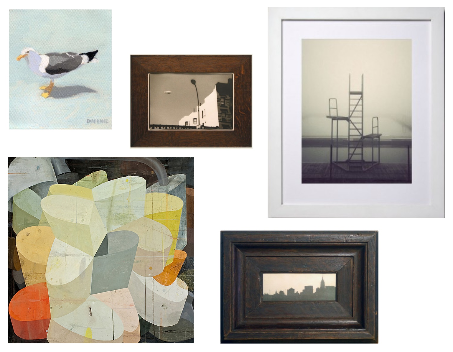
  • Danish photographer Kim Holtermand captures abandoned cities with a palpable sense of emptiness. "Pool Chairs," in particular, feels simultaneously like a landscape in which human presence has intruded, unwelcome, and a portrait of an inanimate object rendered lonely and obsolete by the absence of human presence. (I mean, sure, maybe it's crazy to say to say that pool chairs have emotions. But I dare you to look at that shot and tell me you don't want to pat those pool chairs on the back and say, "there, there. They'll be back-- summer's just around the corner.")
  • Silver and platinum gelatin prints of architectural forms. Both Jefferson Hayman (represented by Schoolhouse Gallery) and Adrienne Moumin have chosen as their medium that most painstaking and retro of photographic techniques. It seems particularly well suited to cityscapes and architectural detail. 

Check out these gems-- a few of my favorite pieces spotted at the show:


Sources (clockwise from top left)

  1. Seagull 13 (11x14 print, edition of 50) by Elizabeth Mayville, via Art Star - $50 ($125 framed)
  2. Airship West Village by Jefferson Hayman via Schoolhouse Gallery
  3. Deserted City: Pool Chairs (30x40 print, edition of 50) by Kim Holtermand, via Art Star - $450 ($750 framed)
  4. Untitled by Jefferson Hayman via Schoolhouse Gallery
  5. What you must do to get home safely (36x36 oil on canvas) by Deborah Zlotsky, via Kathryn Markel Fine Arts - $5,000


Sources (clockwise from top left)

  1. Crescent, (30x30 abstract oil painting from billboard remnants) by Cecile Brunswick - $4,800
  2. Observing Presence, Series #8 2010 (21x13 pieced vintage silk) by Debra Smith, via Kathryn Markel Fine Arts - $1,800
  3. From the High Line 2012 (24x24 oil and pencil on panel) by Lisa Breslow, via Kathryn Markel Fine Arts - $8,000
  4. Snowy Branches #156 (15x15 limited edition print) by Dagmara Weinberg
  5. Brooklyn Sometimes Reminds Me of Europe by Jefferson Hayman, via Schoolhouse Gallery 
  6. Hirshhorn Courtyard (hand printed silver gelatin photograph) by Adrienne Moumin, via Picturexhibit

Tuesday, March 26, 2013

Leather (Pull) Fetish, Continued...

In January, I wrote of my interest in Leather Pulls, and after doing my research began a DIY project for pulls on newly installed and painted cabinet doors.  Wondering where to get the leather, I noticed that some baskets I owned and used as storage in bookshelves had leather straps on the front side and backside of the baskets. I decided I would try making handles from those I had to hand.


I removed the handles from the storage baskets and readied them to be attached to the door.


My thought was to double them and use four screws to fill the holes that were already on the leather straps. I  hoped to find rustic screws with interesting looking heads because they would be exposed. I tried carpet tacks, which did not hold when pulling open the door. Screws looked unfinished.

At this point, I became skeptical of my ability follow through on this project and I needed to get into the closets! I started shopping the internet to see what pulls were available, be easier to intall and have a more finished look. I discovered Doug Mockett and Company had sturdy and attractive leather pulls with all the parts needed for installation. At 35.85 per handle, needing four brought up the cost of the hardware to 148.00. The four pulls (one shown below) arrived in four days.
I then measured the height I wanted them to be installed. The pulls came with screws, bolts and a decorative cap to cover the head of the screw.  The problem was that the door was thicker than the length of the screws and would need to be counter sunk. This was now beyond my limited drilling experience! It was time to call in the expert...

Nick Chepinkskas of NPC Carpentery. Nick is an excellent carpenter who works throughout the East End of Long Island and the creator of  the new doors. He came to the rescue in and about 5 minutes had the holes drilled, screws countersunk, bolts attached and the decorative caps installed. With a gentle pull the closet doors opened and all was looking great!  Thanks, Nick!


I learned my lesson: there are times when DIY just doesn't work and an expert must be called in.  It's OK to "Cry Uncle" and  pay up to get the job done right. 

Monday, March 25, 2013

AD Show 2013: Textiles

I was lucky enough to steal a couple hours on Friday to slip over to Architectural Digest's Home Design Show. So much to discover! (Once you got in, that is. There was lots of grumbling in the snaking line outside Pier 94, where members of the public who bought tickets in advance were made to wait for 20-30 minutes in the bitter cold. This year, for the first time, they printed individual name tags for all entrants with a bar code that vendors could scan when you stopped by their booth. A nice idea for tracking interest by booth, in theory, but the fact that every single attendee had to check-in at the registration desk and wait for an individualized name tag to print was a logistical nightmare. I heard a couple people who have been attending for years swear it would be their last show.)

Since this was my first time attending, I wasn't sure what to expect. I'm not much of a textiles expert (I tend to gravitate towards art and furniture at these trade shows), so I was surprised to find myself stopping into so many textiles booths. 

Here are a few stand-outs from the people behind each of my favorite booths:


Sources (clockwise from top left)

  1. 3' x 3'1"Najavo (CU-984), Lavender Oriental Carpets
  2. Hampton 10'1"x13'2" (Ref no. 2876), Nasiri
  3. Foil by Elastic Co.
  4. Fluff by Hiroko Takedo
  5. Google Pillow 2012, Elastic Co. via Etsy - $75

Lavender Oriental Carpets had the coolest bright orange Navajo blanket-- the weave felt like butter in your hands. I asked the price and heard "sixteen hundred." Alright, $1,600 isn't exactly in my budget for textiles, but I tucked it away as an idea for future clients. When lovely owner Lida Lavender rushed to assure me she had much more affordable Navajo blankets (one of their specialties), I started to suspect that I'd misunderstood. Yup. "Sixteen THOUSAND," she clarified. As in $16,000. Yikes. That's the second time I've made that mistake this month (the first time was inquiring about a Hans Wegner Papa Bear chair at Wyeth in Wainscott. I've resolved to stay at least 100 feet away from that store for the foreseeable future.) Lavender Oriental Carpets, unlike Wyeth, really does offer a wide range of pricing in Navajos, Kilims and many other popular varities. They do custom sizes too! Their website is really easy to navigate too-- I love the "bookmark your favorites" feature.

Nasiri specializes in Persian rugs-- it's owned by an Iranian family-- but offers a wide selection of all sorts of middle-eastern rugs. I particularly like their Modern Collection (surprise, surprise.) I didn't get a sense of pricing, but I have a feeling that they are on the higher end of the spectrum, since they're sort of an institution and a go-to among the types of designers whose work is featured in AD. The "price upon request" type of crowd.

Elastic Co. I love these guys! Have you heard of the Google pillows? They've been around a few years. Every year, Elastic Co. takes the top search terms of the year and prints them on a throw pillow. It's a pretty fascinating concept. I knew the pillows were available via Etsy, but I had no idea that Elastic Co. was also churning out amazing textile installations (like the one in fashion designer Lela Rose's loft by architectural firm Work AC.) The site-specific installations featured on their site are great eye candy, but their drapery is also worth a look. Elastic Co. make drapes for people who hate drapes (i.e. me, a devout shade fundamentalist). Their felt accordion pleat, in particular, is an intriguing way to filter light and add noise insulation without undermining a modern and minimalist decor scheme.

Hiroko Takeda's work is mesmerizing. It reminds me of the weaving equivalent of exposed joinery in woodworking-- her approach to textiles puts the construction process front and center. You can see and touch all the hours of concentration that went into the final product. Yet she somehow manages to preserve the beauty and delicacy of the raw materials. And check out what this talented lady can do with a plastic bag.


Friday, March 22, 2013

Artist + Designer Spotlight: Jane LaFarge Hamill

Until March 30, at the New York City J. Cacciola Gallery you can see Jane LaFarge Hamill's latest work entitled "emoticon".  Hamill painted almost all of the pieces featured in the exhibit during her residency in Leipzig, Germany. (You can learn more about Jane and her residency by watching a video on the subject.)


Allison Malafronte of Fine Art. Connoisseur describes Hamill's work from "emoticon" as follows:

"We have all become accustomed to, and in many ways desensitized by, computerized substitutions for communicating our identities, thoughts, and feelings. Everything from our online avatars and profiles to shorthand texting and messaging helps perpetuate this depersonalization. In looking at the intelligent, thought-provoking paintings in Hamill’s Emoticon exhibition, I see a slight satire of these societal trends, but I also sense a suggested alternative. Whether she is focused on a particular mood of human expression, an iconic image or logo adopted by an athletic figure, or the intersection of inordinate ideas and concepts, the artist seems to be showing us where our attention and devotion divide. In many ways it’s as if she’s trying to refocus that attention, with a complete understanding of how fragmented it has become. She obliterates faces, blurs lines, and shakes up the stylistic status quo to show us that one can never fully define or capture human emotion or existence — because it lives and moves and breathes, unlike our static online counterparts."

When I attended the opening of Jane LaFarge Hamill's "emoticon," I was struck by how her skilled portraiture interacted with the color infused world layered on top of each of her works. There is something mysterious and urban in the overpainting. The art certainly succeeded in drawing me in-- I dream of owning one of these pieces:

 Hawaii: 27x22 oil on canvas
As If They Were Always There: 27x22 oil on canvas
The Limitations of Language: 27 x 22 oil on canvas


Thursday, March 21, 2013

My (Virtual) Renovation Diary | Clinton Hill 1BR Co-Op, Kitchen Stop Gap Measures

I've been intrigued lately by what I'd term "design stop gaps." Many first time buyers, I think, find themselves in a situation where they've stretched their finances to buy a home that they desperately want to fix up. But before they can tackle the significant expense of, say, a kitchen renovation, they need to give their bank accounts some R&R. Sometimes years of R&R.

Philosophically, I fully support living within your means and taking a slow approach to design. But I also sympathize with the pain that the aesthetically-minded among us suffer when they cohabit with builder grade cabinetry and laminate countertops. Your home is meant to be your refuge, but it can also be an ugly reminder of strained finances and the tough slog of renovating ahead.

Happily, there seems to be a flood of inspiration on the web (by which, let's be honest, I basically mean Pinterest) for stopgap measures. Relatively fast and cheap ways to make that R&R period less visually caustic.

For my virtual renovation of a Clinton Hill 1-bedroom co-op, for example, I would want to take my sweet time to consider appliances, fixtures and materials. But I would not relish living with this in the meantime:

via The New York Times

Floorplan Excerpt, via The New York Times

Yikes! It kills me that the kitchen is described in the listing as "recently renovated." I am certain it was a good faith effort at improving the value of the property and I hate the idea of those newly installed materials going to waste. But on the other hand...that kitchen is just not doing it for me. Three words, friends (two if you count the hyphenation as one word): Counter-Depth Refrigerator.

My long-term plan would involve a change in layout. I've always wanted a window above my kitchen sink. As my loved ones can attest, I am not the most motivated of dish washers. But a view might change that! (Wishful thinking?) I'd move the dishwasher to the left of the sink for ease of loading and center the range on the back wall. I like the idea of building an island adjacent to the structural column, although it's hard to be sure without a sense of how the space feels in person. (Also, the scale of this floor plan is an utter mystery to me thanks to web upload distortion and the notorious unreliability of real estate floor plans.) When I drafted this altered floor plan, I intended to extend the counter on the windowed wall all the way to the corner. But now that I have a fancy new waste bin, I might prefer to reserve a spot for it. Here is my working vision for the post-(virtual)-renovation layout:


Modified from Floorplan Excerpt, via The New York Times

But that's all years away, remember!? So what do I do with this kitchen in the here and now? Here are a few of my favorite kitchen stopgap measures, in decreasing order of labor intensiveness:

1. Whitewash Builder-Grade Wood Cabinets 

White paint is the epitome of a cheap and easy makeover. Granted, when you're talking about course-grained wood cabinets slathered in untold layers of polyurethane, it's not as simple as painting dry wall. But there are products and tools that can help make this a manageable DIY job. Chief among them is your trusty friend sandpaper. Grain filler also wants in on the action (see Little Green Notebook's Kitchen DIY for a primer, no pun intended, on working with grain filler). If you're more of the one-stop-shopping type, try Rustoleum's Cabinet Transformations.

2. Replace Laminate Countertops with Concrete Overlay

Kara Paslay's Before/After, featured on Apartment Therapy, blew me away. She peeled the laminate layer off a client's countertop and replaced it with thin layer of Ardex Feather Finish (a product designed for concrete flooring overlays, and therefore, well up to the task of kitchen counter wear and tear.) Here is what the finished product looks like:

via Kara Paslay Design

While the style of the kitchen she transformed is a bit dark and traditional for me, I love the concept of transforming laminate into concrete. I'd take the idea and head more in this direction:

Feilden Fowles Architects, via Remodelista

3. Remove Upper Cabinet Doors to Create Open Shelving

This trick isn't for everyone. But since my dishware is 100% white and in fairly good shape, the idea of  ditching those oppressive and traditional upper cabinet doors in favor of a lighter, more open space is a design slam dunk. And all it takes is a screwdriver (and most likely, a couple dabs of wood filler for any visible hinge holes.) This is the look I'm aiming to achieve with the open shelving:

Philadelphia Loft Space by Qb3, via Remodelista


4. Upgrade Lighting

There are a couple ways I could go in terms of lighting. Technically, I wouldn't need to wait until the full on kitchen renovation to upgrade the overhead lighting situation. I could have an electrician install track lighting ASAP, but I think I would prefer to wait on a lighting plan until I finalize my kitchen scheme. While I'm generally in favor of functional vs. decorative lighting in the kitchen, I might like to use temporary lighting as an opportunity to add character to the kitchen. Since I would plan to live with this white, concrete and stainless steel kitchen for years, it might be nice to introduce wood for warmth and to tie in the flooring. (I didn't explicitly mention this in my flooring post, but the tile would be replaced with hardwood for continuity throughout the apartment.) Once the lighting was upgraded during the renovation, I would plan to move the temporary fixture to a different location in the apartment. The Andrea Claire Studio light fixture I'm currently coveting would do very nicely, providing it threw off enough light (unclear from her website.)

The Constantin Series, via Andrea Claire Studio

 A significantly less expensive option would be Ikea's FUGA ceiling spotlight. I have this light in the bedroom of my Brooklyn apartment and can vouch for its budget-friendly splendor:

FUGA - $50, via Ikea

In reality, I almost certainly go with the more practical FUGA spotlight, but it can't hurt to dream about the Andrea Claire fixture. 

5. Add Ikea's Stainless Steel Floating Shelves and Free-Standing Island

There seems to be unused wall space to the left of the kitchen window. I might prefer to use the space for art, given the amount of open shelving I would have after removing the upper cabinet doors. But it's nice to know that Ikea's LIMHAMN shelves in stainless steel are an option. While I don't recommend their EKBY MOSBY shelves for wet spaces (and neither does Ikea-- they stain almost instantly), this is a pretty stellar look:

via Desire to Inspire

Another Ikea kitchen stand-by is their FLYTTA rolling island cart, also in stainless steel. I like the idea of expanding my prep space in the temporary kitchen, while getting used the idea of having an island pre-renovation. If it turns out that it obstructs the flow from kitchen to living space, or that adjoining it to the column is too far away from the appliances, I'm only out $159 (amortized over a couple years of use, no less)-- not a couple thousand for a custom island! Ikea's free standing kitchen units, albiet more expensive, provide a more substantial alternative to the FLYTTA. 

FLYTTA - $159 via Ikea


Your Poster Child for Kitchen Stop Gaps:

While I've seen various home owners and DIY bloggers apply variations of each these strategies over a dozen times, the poster child for an inexpensive kitchen transformation has got to be Wendy Furman, whose California home was recently featured in Remodelista. Furman combined nearly all of these strategies, and even added a dose of contrast by painting the backs of her upper cabinets, to create a clean, comfortable kitchen with only a few small changes:

Napa Valley Home of Wendy Furman, via Remodelista

Phew, I'm reassured that I could make this kitchen liveable-- nay, beautiful-- while I save my shekels for a full (virtual) renovation.

Tuesday, March 19, 2013

complement|contrast: Saatchi Online Spotlight on Latin American Artists

Saatchi Online's weekly newsletter is a great way to discover up-and-coming artists, whose original work is still "affordable" (by art world standards, that is.) I'm particularly jazzed about this week's edition because the focus is on Latin American artists. Anyone who knows my family knows we have a real soft spot for Latin American art and textiles-- and a house chock full of Brazilian and Andean flea market finds.

For today's installment of complement|contrast, I selected Frida (24 x 18" Acrylic on Canvas) by Argentine artist Royal Priest and No Title (23.6 x 31.5" Acrylic on Canvas) by Brazilian artist Tania Nitrini. In addition to the typical rules of the game for complement|contrast, I made an effort to incorporate pieces from Design Within Reach, in honor of the final day of their Semi-Annual Sale. Final hours, people-- 15% off nearly all of their collections!

complementary palette | contrasting style

I was attracted to Royal Priest's Frida Kahlo "remix" for its bold palette and a distinct sense of place. But I especially love that he plays with time by contrasting the iconography of Kahlo's original works with a contemporary subject. I was inspired to continue Royal Priest's distortion of time, and further distort by playing with the sense of place.


complement| The palette is queued off of the painting's rich spectrum of reds and greens, with hints of brown and black providing a neutral stabilizer.

contrast| The art work evokes a lush, humid and wild backdrop, where the angular furnishings lend a feeling of the cool rigidity born of industrial construction. The reference to Frida Kahlo's iconic paintings plant you firmly in the Latin America pantheon, where the decor is heavily influenced by Scandinavian design and the German Bauhaus-- while the nationalities of the designers behind the furnishings span three continents. The jungle is timeless, where the decor is distinctly 1950s/1960s retro. The artist, too, plays with a sense of time in his modern spin on Kahlo's work. The contrast is inherent in the paintings and further accentuated through the use of iconic mid-century pieces.

Sources (Clockwise from top left)

  1. Frida, 4 x 18" Acrylic on Canvas, by Royal Priest via Saatchi Online - $1,500
  2. Lean On Me Table Lamp, Bo Concept - $399
  3. Earl Credenza, Thrive Furniture - $3,199
  4. Stobel Textile, via Dessau Bauhaus (for Bauhaus inspired rugs that are available for purchase, see Oyyo's collection.)
  5. Eames 2 Seat Sofa, Design Within Reach - $8,719-$9,318
  6. Girard Table, Design Within Reach - $925
  7. Paulistano Outdoor Armchair, Design Within Reach - $1,062-$1,250  (*semi-annual sale price)


complementary style | contrasting palette

I'm a sucker for concentric squares. So when I saw Nitrini's Joseph Albers-inspired piece, I knew I wanted to run with the concept of grid logic. To me, this grouping epitomizes Brooklyn style-- an abundance of graphic patterns, nods to the design pantheon and an eccentricity that walks the line of discord-- the sort of edge you can only really achieve when you're just one concentric-squared throw pillow away from triggering epilepsy in your house guests. It's a tricky tight rope to walk, for sure, but my fellow Brooklynites seem up to the task. I picture this arrangement in a old brownstone with weathered, farmhouse flooring. 


complement| The furnishings, lighting and textiles echo the concentric squares found in Nitrini's piece, although they play with the dimensions and regularity of the squares. To provide relief, the ottoman abstracts the central concept one level to form a diamond pattern out of overlapping squares.

contrast| Where the painting's palette is cold, reclaimed wood and velvet upholstery offer warmth and rich texture. A spring and mint green set off the burst of orange in Nitrini's piece, while brass legs contrast with the palette's steely grays. A single strain of orange detected in the throw's weave and the copper hardware of the lighting fixture keeps the arrangement from veering into haphazard.

Sources (Clockwise from top left)

  1. Nos Das Throw by Donna Wilson, Design Within Reach - $102-$267.75  (*semi-annual sale price)
  2. Framework Credenza, CB2 - $599
  3. Bluff City Pendant - Large, Design Within Reach - $637.50 (*semi-annual sale price)
  4. No Title, 23.6 x 31.5" Acrylic on Canvas, by Tania Nitrini via Saatchi Online - $1,000
  5. Kite Kilim Floor Pouf - Iron/Straw, West Elm - $249
  6. Major Chair Satin Brass Finish - Emerald Velvet, Mitchell Gold + Bob Williams - $1,245


Thursday, March 14, 2013

Artist + Designer Spotlight: Kai Samuels-Davis and Clare Elsaesser

Yes, I am straying from my mission to highlight local artists and designers (again), but you've got to check out this Etsy power couple. California-based artists/husband-and-wife duo Kai Samuels-Davis and Clare Elsaesser are killing it with their respective Etsy shops.

Samuels-Davis's shop Windy Lane Studio offers originals and prints of his moody portraiture and haunting landscapes. I find his work very masculine and arresting, especially his portraiture. Here are a few of my favorites pieces:


Sources (clockwise from left)
  1. The Uncertainty, Original Oil Painting, 16x12 inches- $1,150
  2. Pomegranate Study, Original Oil Painting, 16x20 inches- $1,250
  3. A Fragment II, Fine Art Print of Oil Painting, 4x4 inch image size/7x5 inch paper size - $15
  4. The Other Field I, Large Digital Fine Art Print of Oil Painting, 8x18 inch image size/13x19 inch paper size - $50
  5. Bodega Sunrise, Large Art Print of Original Oil Painting, 9.5x16 inch image size/13x19 inch paper size - $50
  6. The Guide, Original Oil Painting, 10x10 inches - $850
Clare Elsaesser's body of work, also available as original oil paintings or as giclee prints from her shop Tastes Orangey, has an intriguing duality to it. Many of her pieces are the yin to her husband's yang-- feminine with an element of romantic fantasy. Her series of women in nature call to mind the mythology of wood and water nymphs. (And by "in nature," I mean really IN it-- immersed in, obscured by or melding into it.)


Sources (clockwise from left)
  1. Never Empty Handed, Original Oil Painting, 24x30 inches - $1,100
  2. Watching Trees, Large Giclee Art Print, 16x20 inch image size/17x22 inch paper size - $65
  3. Flower Child, Original Acrylic Painting on Watercolor Paper, 8x10 inches - $215
  4. Married to the Sea, Large Giclee Art Print, 16x20 inch image size/17x22 inch paper size - $65

But then Elsaesser surprises you with her series of sleeping couples that manage to express the reality of young love. You work all day, apart. Then fall into bed exhausted, together. The majority of your interactions with your partners are unconscious or in the midst of pre- and post-sleep ritual. (I swear some days the only chance Ryan and I have to chat is while we're brushing our teeth and barely understand half of what the other is saying.) I always found that sort of sad and sweet. Elsaesser perfectly captures both emotions. Her subjects' body language is both quotidian and romantic. Here a few of my favorites from her scenes of everyday life:


Sources (clockwise from left)
  1. Three, Archival Giclee Art Print, 5x5 inch image size/8.5x11 inch paper size - $15
  2. Sweet Dreams, Large Giclee Art Print, 16x16 inch image size/17x22 inch paper size - $65
  3. Undress, Olive Green Giclee Art Print, 8x10 inch image size/8.5x11 inch paper size - $25
  4. Striped Sleeper, Extra Large Giclee Art Print, 16x20 inch image size/17x22 inch paper size - $65

When you check out her portfolio on Etsy, be sure to read the poems she occasionally writes to accompany her work. This verse, my favorite, corresponds to Three, the print pictured above:

Three pillows
are better than two
three pillows might be better than you.


Wednesday, March 13, 2013

My (Virtual) Renovation Diary | Clinton Hill 1BR Co-Op, Part II - Built-in Units

Don't worry-- I haven't forgotten about my (virtual) renovation of a Clinton Hill 1-bedroom/1-bath Co-op, although I have had a slight change of heart on the order of construction.

To recap: in my last post we stripped off layers of old paint where necessary, painted the walls and replaced the flooring throughout the apartment. I had initially planned to tackle the bathroom next. But selecting fixtures and materials for a bathroom requires careful planning and research. I have a few ideas, but I'm not quite ready to take the plunge-- even a virtual one.

Instead, I'd like to focus today's virtual renovation on built-in units, including new radiator covers. The existing radiator covers are in need of modernization.

via The New York Times

If you run a Google image search for "radiator cover" it's easy for the contemporary design lover to despair. But cheer up! I've collected a slew of images of radiator covers that fit perfectly into a modern home.


Sources (clockwise from top left)

  1. Custom Radiator Cover by Emma Victoria Interior Design
  2. via Pinterest
  3. Wooden Curved Radiator Cover, by Jason Muteham
  4. Custom Radiator Cover by Rodriguez Studio Architecture PC, via Houzz
  5. via Pinterest
  6. via Pinterest

As the images illustrate, a custom radiator cover can serve multiple functions. It can extend a window sill to create a deeper surface, provide covered storage or serve as extra "bench-style" seating, depending on the height. 

Since the building is old (built in 1939), I'd like to introduce a touch of weathered material to temper all the modern sleekness I plan to inject in the way of the kitchen and furnishings. Here are two interesting radiator covers that combine rustic elements with a contemporary feel.


Sources

  1. Left: Custom radiator cover by Daniel Greene
  2. Right: Radiator Cover by Nightwood

My favorite is the above left image-- both for its appearance and its back story. The unit features a clean, white and contemporary radiator cover designed by Daniel Greene, but features a ledge made from beams salvaged from the Brooklyn Bridge during a renovation. While I'd love to integrate an old component of the Brooklyn Bridge into my design, I have a feeling I'd have to settle for a less historical salvaged joist. I'd make a few other adjustments, I think. I'd align the top of the joist with the window to create an extension of the sill and I'd ideally prefer a lighter stain. The effect I'm trying to achieve is a juxtaposition of clean, white and sleek with warm, weathered wood. Here's an image of Tribeca loft that hit the nail on the head of that winning combination:

Tribeca loft by Wettling Architects, via Remodelista

Now that I've decided on a design for the radiator covers, I'd like to expand covered storage in the living space. While the apartment is generously endowed with 4 closets, they are all clustered near the entry and bedroom. If you look at the floor plan, you can see that there is one long, uninterrupted wall that runs the length of the living room. That's where I plan to install a built-in unit that integrates covered storage, pull-out flat file storage, open shelving and-- best of all-- home office at the windowed end of the wall that can be hidden when company is coming.

via The New York Times

Here is an inspiration image for the built-in units, with a stow-away home office. Sleek and practical, no?

via Nu Interieurontwerp
I especially love that there's a long open shelf running along eye-level to display beloved objects, but the majority of the storage space is covered. After working with Ryan on an apartment with no less than 5 floor-to-ceiling open bookshelf units, I am practically salivating at the thought of having storage in which I can stash all sorts of junk that need never be organized or artfully displayed when I'm expecting visitors. Just shut the cabinet doors and you're ready for your guests to arrive.


Tuesday, March 12, 2013

Round Up: Toronto Exhibits, Design Shops + Restaurants

Sherry here.

If you find yourself in Toronto and like design, there's lots to see, do and eat along the way. On my last trip to Toronto, I saw evidence of an emerging design scene. The city, Canada's financial hub, is comfortable and livable, but with an industrious pace.  Because the national psyche prioritizes a balanced lifestyle and social programs like universal healthcare, Toronto is drawing young professionals, creative entrepreneurs and those in the arts from all over the country and beyond. The city has a good transportation system, publicly funded universities, cultural venues designed by local firms and Starchitects alike, and an influx of immigrants who lend an air of originality, energy and diversity. The bubbling economy and recent expansion in housing options helps the cauldron to ferment a creative Canadian brew.

Fours Seasons Center for the Performing Arts


MUST SEE EXHIBITION

Marimekko, With Love (January 21-April 21, 2012)
Textile Museum of Canada, 55 Centre Avenue | website

Armi Ratia founded the iconic textile house in 1951. "Marimekko, With Love" highlights the early decades of the Finnish design company and the distinctive vision and culture that has kept it at the forefront of modern textile design.

via Textile Museum of Canada


DESIGN SHOPS

Absolutely Inc. 
1132 Yonge Street | website

An uptown mix of merchandise from vintage furniture, tabletop wares and jewelry, to original art and contemporary lighting and accessories. I rarely emerge from Absolutely empty handed. This last visit I was particularly enamored of a vintage fur collar that looked great casually tossed over a sweater, Game-of-Thrones style.

A Cheery Display at Absolutely Inc.


Green Light District
365 Roncesvalles Ave | website

A small airy store run by David and Deborah Peets. The two are enthusiastic collectors of original furniture with a modern bent. Much of the merchandise in the store is sourced directly from artisans in far flung parts of the world. My favorite piece in the store is the "loves me, loves me not" table. Each carved wooden "petal" can be pulled out for a place to sit one's cocktail, iPad mini or BlackBerry (hey, it's Canada!) Once reassembled after the party, it forms a lovely floral centerpiece between lounge chairs.

The 'Loves Me, Loves Me' Not Table at Green Light District
Peaks & Rafters
585 Dupont Street | website

Peaks & Rafters is an art gallery, home furnishings store and full-service design shop all rolled into one. There are bed linens, pillows, carpets, napkins, lamps and even fabulous felt belts and shortbreads! The shop is bright, comfortable with wonderful works by Canadian artists. Owner Katelyn Jarrett has created a welcoming space that invites visitors to dream of a better looking home...or at the very least of dressing up their jeans.

Colorful Felt Belts at Peaks & Rafters
Mjölk
2959 Dundas St W | website

Ok, so what modernist doesn't love Scandanavian and Japanese design? The brilliant concept of combining the heritage of two design-rich nations in one shop makes for a very desirable design destination. If you can't make it to Toronto, their online store alone will have you coveting all things Mjölk (pronounced mi-yelk). I thought the Spin Poufs by Claesson Koivisto Rune were inviting for adults and children alike. There are wooden cutting boards by Oji Masanori, fine art photographs (my favorite photograph is of giant glaciers, with a tiny-in-comparison nude fellow on an ice flow in the foreground) and artisanally-crafted dining chairs by Maruni. All of their wares are meticulously displayed. And if there is not room in your budget or suitcase for any of their products, you can always come away with the shop's stylish business card: a Danish flag rendered in black and white.

Claesson Koivisto Rune's Spin Poufs at Mjölk

Pimlico Design Gallery
643 Dupont Street | website

At Pimlico, you'll find Canadian contemporary furnishings along with beautifully designed accessories for the home. Owner Tatiana Velasevic believes that household items should be practical as well as beautiful. This philosophy is evident in her line of hand molded bowls by San Francisco-based Tina Frey and graphic striped mugs and trays by the German Krefeld. Tahir Mahmood's brightly colored lamps are perfect in scale-- high design impact with a small footprint. 

Tahir Mahmood Lighting at Pimlico Design Gallery

Burnett
1052 Bathurst Street | website

Gordon and Catherine Runge together own the store I found to be one of the most intriguing shops I visited while in Toronto. This talented couple has been involved in retail, television styling, painting and jewelry design, among other creative ventures. Their current enterprise, Burnett, features vintage furniture pieces in a variety of interesting shapes, restored and made desirable anew with rich paint finishes. Shoppers can easily imagine the vintage pieces in an artfully designed room thanks to Gordon's paintings, displayed on the walls of the shop, that evoke late 50's, early 60's style.

via Burnett


WHERE TO EAT

Starfish Oyster Bed and Grill
100 Adelaide Street East | 416 366 7827 | website

Small and cozy with an eccentric bar. The owner himself poured the laminate over randomly placed oyster shells with a few star fish thrown in for good measure. Our bartender was warm and friendly, as well as efficient and reliable at advising on food and wine selection on request. The oyster selection was varied, fresh and delicious. 

Terroni Bar Centrale
1095 Yonge Street | 416 966 1372 | website

This Italian restaurant is a lively adult-and-kid-friendly spot, just like you might find at old country restaurants in the homeland. The food is authentic too, with a wide ranging menu of popular Italian fare and an excellent wine list. The efficient staff, beautiful light and art work, and delicious food makes Terroni a favorite of mine-- and judging by the crowds, lots of Torontonians agree!

Cava
1560 Yonge Street | 416 979 9918 | website

Self-described as a restaurant with "small plates, big flavors,"the food covers "the vast gastronomic range of the Iberian Penisula." The restaurant does have interesting food. Case in point: black garlic with brussel sprouts. Delicious. So much so that my husband, the cook in our family, finished his meal at Cava and then immediately ordered a case of black garlic online. Expect to order and share a handful of small plates off their "nose-to-tail" menu, which boasts ingredients sourced from vendors that rely on sustainable practices. As you might expect from the name, the wine list offers a handful of nice sparkling cavas. The only downside to this restaurant is its location in an unappealing mall-like complex. Once inside, though,  the decor and flavors of the meal cast aside any doubts you might have had passing through the dreary entrance.

Monday, March 11, 2013

Trend Report: Matryoshka Update

Alex here. Remember when I reported on the Matryoshka trend? I expressed an ambivalence about the look of painted dolls but mused that their unadorned figures would make for original styling props. Well, wouldn't you know that exact idea is bouncing around the blogosphere. (Silly me. Will I ever learn that originality is always hopelessly out of reach?)

Check out these minimalist matryoshka. The first is an image from Amy Azzarito's new book, Past & Present: 24 Favorite Moments in Decorative Arts History and 24 Modern DIY Projects Inspired by Them.The second image is from the inspiring budget-conscious renovation of architect Jen Turner's Carroll Gardens carriage house, featured on Remodelista. Both well worth a read!

PS You can check out my instagram feed for a couple of behind-the-scenes shots from our photo shoot this weekend.


Thursday, March 7, 2013

Disconformity

If I were a window today, I'd be that window. A bit askew. 

My mom and I are prepping for a big photo shoot this weekend (the details of which will soon be revealed), so we are taking a brief hiatus from the blog. 

Have a happy weekend!

via Flickr

Wednesday, March 6, 2013

My (Virtual) Renovation Diary | Clinton Hill 1BR Co-Op, Part I

Alex here. I'm firmly in a "renter" stage of my life. And, truth be told, I'm content with that. Between juggling two jobs and evening school, it's a relief to know that when the dishwasher isn't draining properly, all I have to do is email my landlord and, voila, the dishwasher is magically fixed within 48 hours. (Yes, I am extremely lucky to have kind, efficient, live-in landlords.)

I also like the idea that come any given April (my lease renewal month), I could pack my bags and move across the world to purse an exciting job opportunity. When you're 25 and trying to figure out what the heck you want to do with your life, that brand of freedom is arguably a more valuable commodity than real estate.

But that's not to say that I don't experience the occasional twinge of longing for a space all my own. A space I could transform from "eh" to a knock-out. Especially when I read Apartment Therapy's Renovation Diary. Which brings me to my serial addiction to real estate listings. As a kid, I would panic whenever my parents browsed real estate for recreation-- "Are we moving!?!"

Now I totally get it. Take this Clinton Hill 1-Bedroom/1-Bath Co-Op, for example, listed at $385,000. Over-sized windows! Open plan living! Flooded with light! Views for miles! Massive amounts of space! A grand total of four closets! Even a windowed nook for a possible second bedroom. Not to mention, it's practically on the campus of a top design school.

via The New York Times

But there's still room for improvement-- a real estate browsing requirement as basic for me as running water. I don't love the choppiness of parquet floors. And those radiator covers have seen better days. The kitchen, while "recently renovated", leaves something to be desired aesthetically. And the bathroom is practically begging for my love and attention. Just a fresh coat of white paint and a new medicine cabinet would do wonders.

via The New York Times

So how about we roll up our sleeves and do some (virtual) renovating? Cool. Before we start, I need to disclose a weird quirk: even in my daydreams, I like to be somewhat practical. Rest assured, they'll be a few splurges. But I will take into account practicalities like my lifestyle and resale value. Design is, after all, born of limitation.


Step 1: Flooring + Painting

Why is this step 1? Because I'd like to replace the flooring and paint the apartment before I move in. One of my first steps after closing will be to suit up in my hazmat attire and strip the decades of paint off the window trim. When you own an apartment with age and character, there's something very fulfilling about scraping off those layers instead of adding to them.

Some might argue that major alterations to the floor plan, kitchen and bath should take precedence. But since this apartment is a major (pretend) investment for me, I want to live in the space and learn from how I use it before I go mucking around with anything structural or spacial.

Decision 1A: Concrete vs. Hardwood


Left via Dezeen | Right via Bloesem

I love concrete flooring. Beautiful, dog-friendly, easy to clean, relatively low cost and low maintenance. But a little inconsistent with the feel of the building (built in 1939) and not as valuable as hardwood for resale. I think I'll save concrete for my modern prefab in the country. Winner: Hardwood (right)

Decision 1B: Herringbone vs. Wide Plank


Left via Nordic Design | Right via Desire to Inspire

I love the look of both. But since I am am happiest in a contemporary home, I must be true to what makes me happy. (And forgive the gross factor here, but when you have a dog, you realize those tiny cracks between planks are plenty big enough for liquid to seep into and real tricky to clean inside. The wider the floorboards, the fewer the cracks.) Winner: Wide-Plank (right)

Decision 1C: Type of Wood and Stain


Left via SFGirlbyBay | Right via Dinesen

Another toughie! The Scandinavian in me is attracted to white-washed floorboards, with a slightly rustic grain. But the dog lover says soft woods (like pine) and white floors are a nightmare waiting to happen. I'm leaning towards oak, so I'm following my heart and opting for Dineson's Heart Oak in a clear lacquer finish for extra protection. (Danish company Dineson, if you're not familiar, makes very fancy flooring.) Winner: Dineson's Heart Oak Flooring, Clear Lacquer (right)

Decision 1D: Paint Color
via Remodelista

In the modified words of Henry Ford, "any color, as long it's white." I'm a white paint fanatic. It's funny to me when people describe a home as "museum-like" or "gallery-like" in a pejorative context. Who wouldn't want to live in a fabulous gallery or museum? In my own space, I want a pristine white backdrop that lets my art shine.

The question, though, is which shade of white. For trim, I like Benjamin Moore's Super White in semigloss. For the walls, BM's Decorators White or Simply White are good stand-bys for a true white. But lately, I've seen and liked BM's Mountain Peak white. It's softer than my go-to's, but without yellow undertones. So do I take a chance on Mountain Peak? Maybe in my next apartment. For my first big reno, I want to stay tried-and-true. Winner: Walls - Benjamin Moore's Simply White, Matte; Trim - Benjamin Moore's Super White, Semigloss.

Well, we've done some good work today. We bought an apartment, stripped the windows casings, replaced the parquet flooring with wide-plank heart oak and repainted every inch of wall and trim. I think we've earned a well-deserved rest, don't you? (And maybe a beer or two...)

Stay tuned for Part II: The Bathroom Overhaul.